Simple Design Tips for Better Menus
Welcome to our latest feature on the art of menu design—a critical aspect of the guest dining experience that often goes unnoticed. Far from being a simple catalogue of options, a well-crafted menu serves as the prelude to the culinary adventure that awaits within a restaurant. It reflects the heart of the restaurant's culinary philosophy, its unique brand identity, and the very soul of its kitchen. Our goal with this piece is to equip restaurateurs, designers, and managers with practical, effective design tips that can elevate a basic menu to an engaging piece of communication—a story told in fonts, colours, and layout that begins the moment it's placed into a diner's hands. We'll guide you through the subtleties of crafting a menu that not only outlines your offerings but also showcases them, sets the tone for the dining experience, and ultimately, turns first-time visitors into regular patrons. Dive in as we unveil the secrets to creating a menu that informs, entices, and enhances every aspect of your restaurant's allure.
The introduction to any article on design, particularly one focused on enhancing menus, must underscore the significance of this tool in shaping a diner's experience. Menus are more than just a list of dishes; they embody the essence of a restaurant's cuisine, ethos, and brand. They are a tactile and visual extension of the culinary journey that patrons are about to embark upon. This introductory section sets the stage for readers to understand that a well-designed menu can tantalise taste buds before a single morsel is savoured, making it a critical component of the dining experience. The article aims to arm restaurant owners, designers, and managers with a collection of straightforward, actionable design tips that can transform their menus from mere functional documents to powerful, persuasive tools that communicate the story of the establishment and its offerings. An effective menu design can guide diners through the selection process, highlight signature dishes, and contribute to an overall ambience that complements the dining environment. Therefore, the introduction also serves to entice readers with the promise of learning how to leverage design principles to achieve a menu that doesn't just inform but also engages and sells.
Understanding Your Audience

Understanding your audience is a fundamental step in crafting a menu that resonates and engages effectively. The preferences, lifestyles, and even age groups of your clientele should influence the design choices you make. For instance, a menu tailored for a family-friendly restaurant might focus on large, readable fonts and a fun, colourful layout, while an upscale fine-dining establishment may opt for a more elegant and minimalist design to reflect its sophisticated atmosphere. Recognising who your diners are can inform not only the visual elements of your menu but also the language and descriptions used, ensuring they are aligned with the expectations and desires of your audience. Are your customers health-conscious diners who would appreciate detailed ingredient lists and nutritional information, or are they more adventurous eaters looking for exotic descriptions and unique offerings? Do they prefer a more traditional dining experience with classic dishes, or are they seeking a modern, innovative menu that offers new experiences with each visit? By delving into the demographics and psychographics of your customer base, you can tailor a menu design that not only captures their interest but also enhances their dining experience, making it more likely that they will become regular patrons. It's about creating a connection between the food on offer and the customer's narrative, making the act of choosing a meal an intuitive and enjoyable part of their visit to your establishment.
Clarity Is Key
Clarity in menu design is crucial for ensuring that customers can easily navigate their options and make informed decisions about what to eat. The selection of typography plays a pivotal role in this clarity; the typefaces chosen must be legible and appropriately sized to be easily read by all customers, including those with visual impairments. A well-organised layout is equally important; items should be logically grouped and categorised, such as appetisers, mains, desserts, and beverages, to simplify the decision-making process for diners. It's not just about listing dishes; it's about guiding the customer's eye through the menu in a way that is intuitive and seamless. Effective use of whitespace, section headings, and dividers can help prevent menus from appearing cluttered and overwhelming. The descriptive text should remain succinct to ensure customers are not bogged down by too much information, yet detailed enough to entice them and provide insight into the unique qualities of each dish. The inclusion of icons or symbols to denote popular choices, spicy dishes, or allergen information can further streamline the dining experience, allowing for quick identification of items that meet the diner’s needs or preferences. The ultimate goal of clarity in menu design is to create an enjoyable and stress-free selection process that complements the dining experience, rather than complicating it, empowering customers to make confident choices that they will be satisfied with.
Colour and Visual Hierarchy

Colour and visual hierarchy are instrumental in capturing a diner's attention and subtly guiding their decisions. The psychological impact of colour on human behaviour is well-documented, with certain hues able to invoke specific emotions and reactions; for instance, red is often associated with appetite stimulation, making it a common choice for menus. Utilising colour strategically can create a visual flow, leading the eye to featured items or specials, and establishing a rhythm to the way customers engage with the menu. Contrasting colours, when used effectively, can separate different menu sections and highlight key elements without overwhelming the senses. It's about creating accents and focal points that draw the diner into the narrative of the menu. The visual hierarchy is established not just through colour but also by varying font sizes, bolding, italics, and capitalisation to differentiate between dish names, descriptions, and prices. The hierarchy directs the eye to the most important information first, like the names of the dishes, followed by supporting details, all the while maintaining a balance that is aesthetically pleasing and easy to follow. Clear differentiation between the various tiers of information ensures that the customer's journey through the menu is one of discovery and delight rather than confusion and frustration. Employing colour and visual hierarchy thoughtfully can thus transform a simple menu into an engaging, intuitive, and memorable component of the dining experience.
High-Quality Imagery
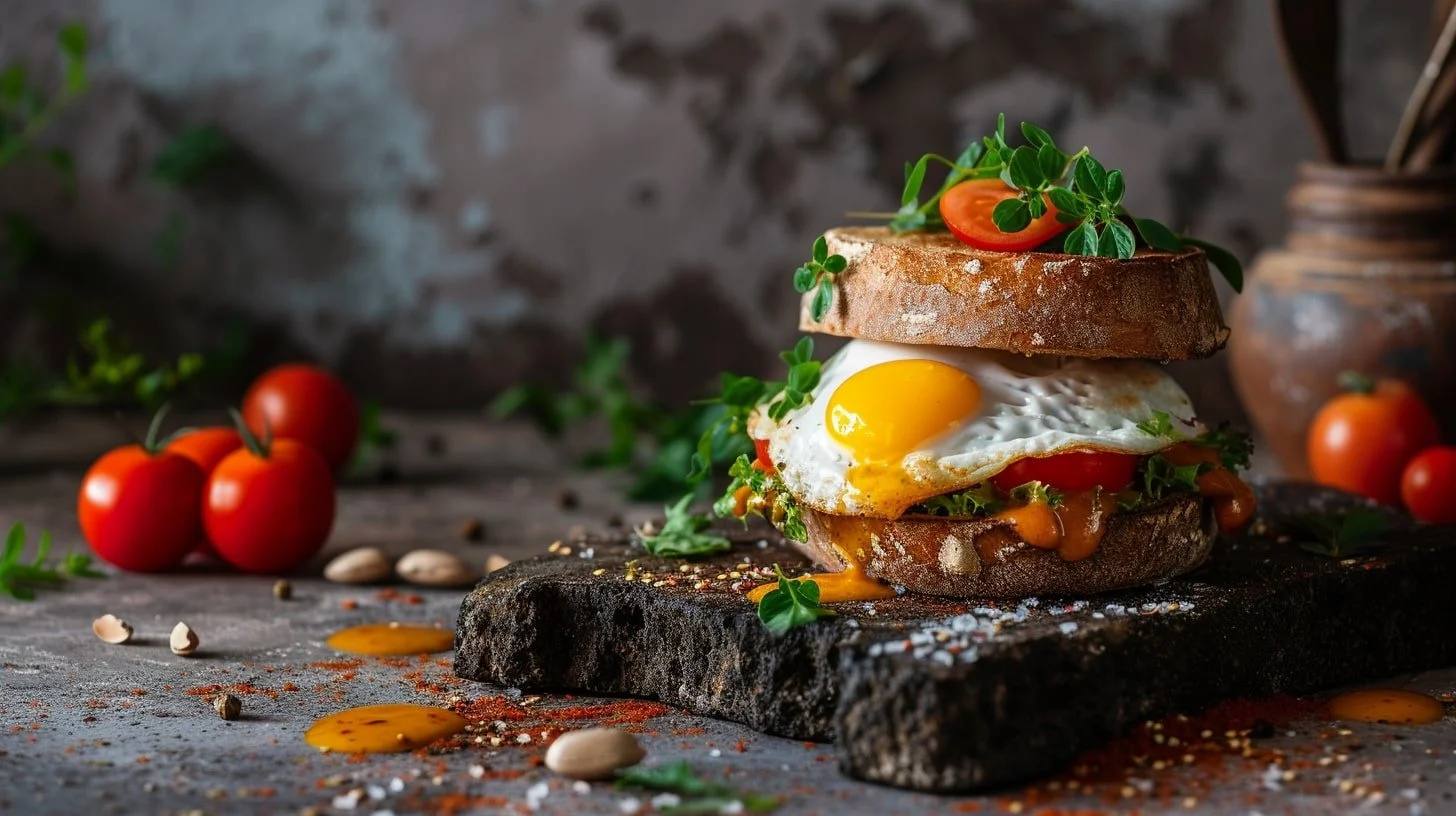
Incorporating high-quality imagery within a menu can significantly enhance its appeal, serving as a powerful enticement for the customer's senses. However, using images effectively requires careful consideration; they should be employed selectively and purposefully to accentuate key dishes and convey the quality and style of the cuisine. The visuals chosen must be of the highest quality, as poor or misleading images can detract from the perceived value of the food and the establishment itself. It's a delicate balance—the images should be mouthwatering and reflective of the actual dishes served, without setting unrealistic expectations or overshadowing the descriptions. In some cases, particularly in fine dining, the decision might be to use no images at all, allowing the descriptions and the reputation of the restaurant to paint the picture for the diner. When used, images should complement and not clutter the layout, ensuring the overall design remains clean and uncluttered. Additionally, for multi-cultural or themed restaurants, images can serve as a visual lexicon, helping unfamiliar customers to understand and appreciate the offerings. This visual strategy can be particularly effective in cases where language barriers exist or when introducing novel cuisines to a new audience. In short, high-quality imagery, when incorporated thoughtfully, can be a powerful tool in a menu’s design that brings dishes to life and visually communicates the taste and quality of the dining experience to come.
Keeping Descriptions Simple
Keeping menu descriptions simple yet compelling is an art that can significantly influence the customer's dining decisions. The language used should be accessible and enticing, avoiding jargon or overly technical culinary terms that could confuse or intimidate diners. At the same time, descriptions should do justice to the dish, highlighting unique ingredients, preparations, and flavours that set it apart. The key is succinctness—providing enough detail to stimulate the imagination and taste buds without overwhelming the reader with verbose explanations. Brevity in menu descriptions can contribute to a more refined and elegant presentation, which in turn can make the selection process enjoyable and even educational. This practice also respects the customer's time, making it easier for them to scan options and make choices, particularly in fast-paced dining environments. Carefully chosen adjectives can evoke sensory experiences and create expectations of each dish's taste and presentation, but it is important to be truthful so that the customer's experience matches or exceeds these expectations. A balance must be struck between the allure of poetic language and the clarity and honesty that foster trust between the establishment and the customer. By distilling the essence of a dish into a concise description, restaurants can tease the culinary narrative they wish to tell, guiding diners through their menu with a curated selection of words that promise a satisfying and delicious journey.
Consistency in Branding

Consistency in branding throughout the menu design is vital, as it not only reinforces the restaurant's identity but also creates a cohesive and immersive experience for the diner. The menu should be a reflection of the restaurant's overall concept, resonating with its aesthetics, values, and atmosphere. This means that the colour scheme, typography, material, and tone of voice used in the menu should align with the brand's visual and verbal language seen elsewhere, be it on the website, signage, or promotional materials. This alignment ensures that the brand is easily recognisable and memorable, fostering a sense of familiarity and trust with patrons. When a menu feels like an extension of the brand, it contributes to the customer's story of the restaurant, which is especially important in a competitive market where differentiation is key. Moreover, a consistent design across all points of contact builds a narrative that extends beyond the restaurant's walls, influencing the way diners perceive the brand before and after their visit. Whether a diner is holding a physical menu in the restaurant, browsing a menu online, or encountering a takeaway flyer, the branding should be unmistakable and convey a clear message about the restaurant's identity. By meticulously maintaining consistency in branding, restaurants can leverage their menus as powerful tools to enhance recognition, differentiate themselves from competitors, and deeply entrench their place within the minds and appetites of their customers.
Practical Considerations
When considering the practical aspects of menu design, it's crucial to factor in details such as menu size, material, and readability under various lighting conditions, ensuring durability and user-friendliness. The physical attributes of the menu can influence a diner's interaction with it; for instance, a menu that is too large can be unwieldy at a crowded table, while one that's too small may be difficult to read and insufficient to showcase the range of offerings. The material chosen for the menu should not only reflect the restaurant's ambience and style but also withstand frequent handling and cleaning, particularly in high-turnover settings. Laminated menus, for example, could be practical for casual eateries, whereas fine-dining establishments might opt for leather-bound menus that contribute to a more luxurious tactile experience. Readability is another essential factor, as menus must be legible in various lighting scenarios, from dimly lit dinner settings to sunny outdoor terraces. The choice of font size, colour contrast, and the type of paper finish all play roles in ensuring that all customers, regardless of age or visual capacity, can read the menu with ease. Additionally, these practical considerations should also include an evaluation of the menu's environmental impact and exploring sustainable paper sources or digital alternatives where appropriate. By giving thought to these practical elements, restaurateurs can create menus that are not only visually appealing but also functionally sound, enhancing the dining experience through their tactile and practical utility.
Updating Your Menu
Refreshing a menu is an essential process for restaurants to stay relevant, cater to changing consumer tastes, and keep their offerings exciting. Knowing when to consider a menu refresh involves monitoring industry trends, seasonal ingredients, and customer feedback. It's about striking a balance between maintaining the beloved staples that regular patrons expect and introducing new, innovative options that reflect the chef's creativity and the latest culinary developments. The refresh process should be approached with strategic forethought; it's important to ensure that any changes are communicated to both staff and customers to avoid confusion and to facilitate a smooth transition. Updates might be minor, such as tweaking descriptions or adjusting the layout for better readability, or more significant, like overhauling sections of the menu or incorporating new themes. Implementation should be carefully planned to coincide with marketing initiatives that can generate excitement and anticipation. For example, promoting new dishes on social media, offering samples or limited-time discounts, or hosting a relaunch event can help draw in customers eager to experience the updated menu. Careful testing of new items and gradual introduction can also help to gauge customer reception and make adjustments before a full rollout. In this way, a well-executed menu refresh can breathe new life into a dining establishment, keeping the brand dynamic and top-of-mind for new and returning diners alike.
Testing and Feedback
Testing and gathering feedback is a pivotal component in the menu design process, serving as a reality check for how well the menu performs in a real-world setting. Engaging customers by soliciting their opinions on the design can provide valuable insights into their dining experience and how the menu contributes to it. This can be done through comment cards, online surveys, or direct conversations, and can help identify areas that are confusing, unappealing, or particularly effective. A/B testing, where two versions of a menu are compared in use, is another method to understand which design choices work best. By varying elements such as the placement of items, usage of images, or description styles, restaurateurs can gather data on customer behaviour and preferences. For example, positioning certain dishes in prominent spots may lead to an increase in their sales, indicating that menu design plays a significant role in influencing customer choices. Digital menus offer even more opportunities for collecting detailed analytics, such as time spent on each page and the sequence in which items are viewed, which can further inform design decisions. The feedback loop created through testing and customer insights must be ongoing, as it enables continuous refinement and optimisation, ensuring the menu remains an effective tool for communication and sales. By embracing a culture of testing and iteration, restaurants can ensure that their menus not only look appealing but also perform effectively, driving customer satisfaction and business success.
Conclusion
A well-designed menu has the power to enhance the dining experience, drive sales, and communicate a restaurant's brand identity. It should be a clear, cohesive, and visually appealing document that speaks to the target audience in an accessible language, reflecting the establishment's ethos and culinary offerings. The use of colour, typography, and imagery should be strategic, supporting the menu's functionality and aesthetic appeal while also promoting a user-friendly layout. Practical considerations, such as material and readability, coupled with regular updates and testing, play a critical role in maintaining a menu's relevance and effectiveness. Ultimately, the goal is to craft a menu that not only informs but also seduces the customer into a gastronomic journey, and doing so requires a balance between creativity and restraint. The process of perfecting a menu design is iterative and should involve feedback from both diners and staff. By synthesising these insights with the principles outlined in the article, restaurateurs can create menus that are not just conduits of information but essential components of the dining narrative, inviting curiosity and delighting the senses.
More Articles about Restaurant PUBLIC RELATIONS


